Every part of your listing has a job. Most hosts make each part do the wrong one, and they polish the least important piece while ignoring the one that decides everything. Here is the real order, and how to make each piece convert.
Your listing is not a description of your property. It is a sales funnel. The sooner you treat it like one, the sooner it starts booking.
Most hosts write it like a brochure. A cute tagline. A wall of adjectives. “Our home is your home.” That copy feels nice to write and it books almost nobody, because it is answering a question no guest is asking.
A listing is a sequence, and every piece has a job. But the pieces are not equal, and treating them like they are is how hosts burn months polishing the wrong thing.
So here is the real order of operations.
The cover photo stops the scroll. The title and the price reinforce it, and together the three of them win the tap into your listing. Then the photos inside win the booking. The description closes it. The fine print decides your reviews.
One of those matters more than all the others combined. The cover photo. Get it wrong and nothing downstream ever gets seen, because the guest never taps in to see it.
When you ask a piece to do a job that belongs to a different piece, the funnel leaks. Then you blame the market, or the season, or the algorithm.
The fix is not writing more. It is making each element do its one job, starting with the one that matters most. Let me walk you through it.
The Cover Photo Is The Most Important Thing On Your Listing.
Nothing else comes close. The cover photo is the one element that decides whether a guest stops scrolling on the search page or sails straight past you. Get it wrong and the rest of this guide does not matter, because nobody will ever see the work you put in.
Here is what it is actually for. The cover photo’s one job is to stop the scroll and make the guest tap in to see more. It is not there to show off your best room. Curiosity beats completeness, every single time.
Think about why. A photo that shows everything gives the guest no reason to tap, because they have already seen it. A photo that shows something striking but incomplete pulls them in to see the rest. You are not trying to earn admiration on the results page. You are trying to earn the tap.
And the tap is the whole point, because the tap is what gets them swiping through your next photos, and that is where the booking is actually won.
Now the move almost nobody makes. Study the competition before you touch your own photo library.
Open an incognito Airbnb search for your area at the guest counts you actually serve. Screenshot the first page. Look at the top ten cover photos and find the dominant pattern. Is it all bright daytime pools? All the same wide interior? All the same drone shot from directly overhead?
Then break that pattern, while still signaling the same product category.
The logic is precise, so do not skip it. If your cover looks like the other nine, you are invisible, because sameness does not stop a thumb. A pattern-break stops the thumb. But if you break the pattern so hard that you stop signaling the category, you stop the wrong people from tapping. So the rule is both halves at once: signal the category, break the pattern.
If everyone shows a bright daytime pool, you show a twilight shot with the lights on, or a drone angle that reveals a layout nobody else reveals, or a tight color-pop detail that intrigues without giving the whole thing away. For a group property, real people enjoying the pool can outperform the sterile empty shot, because it sells the experience, even though the usual advice says keep faces out.
The Title And Price Reinforce The Click. They Do Not Win It Alone.
Here is where most advice gets it backwards, including the version of this you have probably read a dozen times. The title does not win the click on its own. The cover photo does the heavy lifting of grabbing attention. The title and the price are what reinforce that attention and turn it into a tap.
That does not make the title unimportant. It makes it a closer, not an opener. A great cover photo with a vague title leaks clicks. A great cover photo with a sharp title and a fair price converts them. On the search card, the three are read as one thing, in one glance.
So treat your title as the line that confirms what the photo just promised.
You get 50 characters. Only the first 32 show on mobile, and mobile is most of your traffic. So you really have about 32 characters that a scrolling guest will ever see. Front-load them.
The mindset shift: your title is not your property’s name. It is the caption under an ad that already caught the eye, and it has half a second to make that eye commit.
So stop spending it on your brand. A title like “Sunset Retreat Luxury Villa Private Buyout” burns all 32 visible characters on a name nobody is searching for and a phrase that tells the guest nothing they can use.
Use this formula instead: unique amenity, plus proximity to a known place, plus capacity. Something like “Downtown | Heated Pool | Sleeps 30.”
Here is why each lever earns its space.
The unique amenity matches the filter the guest is already using, and it separates your card from the identical ones beside it.
The proximity anchors demand. People do not search for “a villa.” They search for a place near the thing they came for: the festival, the beach, the downtown strip. Name the magnet and you attach yourself to a search that is already happening.
The capacity qualifies instantly. A group of 24 scrolling past needs to know in half a second that you can hold them. “Sleeps 30” does that qualifying for you, so the right people commit and the wrong people keep scrolling, which protects your conversion rate from window-shoppers who were never going to book.
One nuance worth knowing. Airbnb already shows your city and bed count automatically, and it now nudges toward simple, clean titles. So do not waste characters repeating your city. Spend them on the thing the platform will not tell the guest for free.
And do not ignore the other half of the card. The price sits right beside your photo and title, and it is part of the very same split-second decision. A guest weighs all three together before they tap. You can have the best cover photo on the page and still lose the click to a number that feels wrong for what the photo promised. Pricing is a discipline deep enough for its own breakdown, but for now, hold onto this: your photo, your title, and your price are read as a single impression, and they all have to agree with each other.
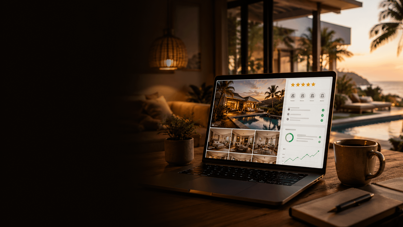
The Next Photos Win The Booking.
The cover earns the tap. Photos two through five earn the booking. This is the most valuable space on the listing after the cover, and most hosts waste it on five versions of the same pool.
The rule is simple. Each of the first five photos shows a different selling point. No two of the same space. No two of the same amenity.
Together, those five have to answer the only three questions a booker is actually asking. What makes this different? Will it fit my group? Is it worth the rate?
The cover hints. The top five deliver.
For the full set, the principle is just enough to show everything, and no more. Here is why that matters. Every extra near-duplicate of the living room pushes the photo that would have sold the booking below a scroll most guests never finish. So cut anything dark, blurry, cluttered, or redundant, and group the photos by space so the carousel reads like a clean room-by-room tour instead of a shuffle.
Put The Closer Photos At The End, Where The Serious Buyers Are.
The guests who scroll all the way to the bottom of your carousel are your hottest leads. They are close to booking. Give them the last few things they need to commit.
Add these at the end, as photos in the carousel.
A floor plan or layout diagram. Group bookers are mentally assigning rooms before they pay. Show them it works.
A custom distance map. Drive times to the airport, the landmark, the venue they came for. It removes the logistics doubt in one image.
Screenshots of your two or three best reviews. Social proof, surfaced in the carousel where browsers actually look, instead of buried in the reviews tab they may never open.
A wifi speed test screenshot. For corporate groups and remote workers, this single image is often the proof that closes the booking.
The logic is that only your most serious guests scroll this far, so this is the cheapest conversion you will ever buy. The assets already exist or take ten minutes to make, and they catch the buyer at the exact moment they are looking for a reason to say yes.
Captions Are For What The Photo Cannot Show.
Every photo gets a caption, and every caption has to earn its space by adding information the image does not already contain.
“Bedroom with king bed” is wasted. The guest can see the bed. “King Bed | Ensuite Bath | Pool-Facing Patio” tells them what is hidden outside the frame.
Use a scannable, pipe-separated format, not a conversational sentence. Browsers skim. Give them stackable facts they can absorb at a glance, not prose they have to read.
A few examples. “Primary Suite | Ensuite | Pool-Facing.” “Outdoor Kitchen | BBQ + Dining for 16.” “Pool | Heated Year-Round | Hot Tub Adjacent.”
An empty caption is a silent question you chose not to answer.
The Description Closes The Booking. So Stop Writing A Poem.
By the time a guest reaches your description, the photos have already done the seducing. The description’s job is to remove the last doubts and close. That is a completely different job than sounding nice, and most hosts confuse the two.
The short hook, meaning the roughly 500 characters that show before “show more,” is the part most guests actually read. It has to work in a five-second skim.
Lead with the fit in one fast line: who this is for, and how big. Then a scannable checklist of the best parts, emoji and a short phrase, not a paragraph. Then one line of positioning that names who this is built for. Then a soft prompt to contact the host.
Here is why a clever tagline fails up here. “The most [adjective] stay in [city]” feels smart and answers none of the three buyer questions. Lead with the answers, not the adjectives.
For “The Space,” be a tour guide, not a copywriter. Walk them through it.
Cover the layout: how the property is structured and how it actually feels to move through. Cover the sleep arrangements, and be specific, because a group booker is deciding who sleeps where before they pay. You put “Sleeps 30” in the title. You put the exact bed configuration here. Vagueness in this spot loses the booking to the listing that spelled it out.
Then cover the outdoor space: the pool, the kitchen, the fire, and why the shared space is the heart of the property.
For “Guest Access,” say exactly what is included and what is off-limits. Specific beats warm. “Full access to all 11 bedrooms, the pool deck, the courtyard, and the outdoor kitchen” converts. “Our home is your home” converts no one.
The through-line of this whole section is one idea. Specificity is the close. Adjectives are not.
The Fine Print Is Where Your Future Reviews Are Decided.
The “other things to note” section looks like boring housekeeping. It is actually the most important part of the listing for your rating, and almost nobody treats it that way.
Here is the mechanism, and it is worth burning into memory. Guests do not downgrade you when reality is imperfect. They downgrade you when reality surprises them.
So every possible surprise goes here, in writing, before they book.
Quiet hours and any local ordinance. Any amenity that costs extra or needs lead time, like pool heating with a fee and a notice window. Anything shared, limited, or first-come, like a single projector or limited parking. Anything that is a paid local add-on rather than included, like bikes rented through a vendor. Trash and recycling days, seasonal notes, and your permit or registration number.
Now the logic, spelled all the way out. A guest who reads “pool heating is an added fee with 48 hours notice” and books anyway cannot leave you a one-star about a cold pool. You disarmed the complaint before it could exist. This section is review insurance, and it costs you nothing but the honesty to write it.
If you want the full system for turning satisfied guests into 5-star reviews, that is its own playbook. This section is where it starts.
Neighborhood And Getting Around Are Not Filler. They Close The Logistics Objection.
Two groups deciding between your villa and a near-identical one will book the one that already answered “how do we get there, and what is around.” Make that one yours.
Structure the neighborhood by distance, not by vibe.
Walking, under 10 minutes: name five to seven real places with walk times. Short drive, 10 to 20 minutes: the bigger attractions. Day trips, 30-plus minutes: the famous names nearby.
If a major demand driver sits close by, a festival ground, a stadium, a beach, a landmark, state the distance explicitly. That one line is often the entire reason the booking happens, because the guest came searching for proximity to exactly that thing.
For getting around, give them the parking reality, the airport options with rough cost and time, how reliable rideshare is, and how walkable it all is. For event weekends, name the surge pricing and the shuttle.
This looks like generosity. It is actually objection-handling. Every unanswered logistics question is a reason to hesitate, and hesitation is where bookings quietly die.
Amenities Are A Search Filter, Not A Checklist.
This is the part hosts treat as a formality, and it quietly costs them more bookings than anything else on the page. Read this twice.
Every amenity you have but did not check is lost visibility in filtered search. Every amenity you checked but do not have is a one-star review waiting to happen.
The mechanism on the first half: guests filter. Someone who needs a hot tub ticks the hot tub filter, and if you did not check it, you simply do not exist for that search. It does not matter how good the rest of your listing is. You were never in the running.
The second half is just as expensive. A falsely checked amenity is a promise, and a broken promise on arrival is exactly the kind of surprise that produces the bad review we just talked about.
So walk every category in the editor against the ground truth at the property. Check everything that is true. Uncheck everything that is not. Then re-audit whenever the platform adds new amenity options, because every new filter is a new way to be found.
Your Settings Are A Posture. Empty Nights Mean Maximum Flexibility.
Your settings are not neutral defaults. They are a stance on how badly you want each booking. Most hosts set them backwards: strict and gated while sitting half empty.
The principle is simple. Tighten only when you are consistently overbooked. Until then, flexibility is the correct posture, because every gate you add removes real bookings to prevent rare problems.
Here is the setup for a listing that is not yet full.
Instant Book on. The algorithm rewards it and many guests filter for it, so turning it off makes you invisible to those guests and slower for everyone else.
Minimum stay of 1 night midweek, 2 on weekends, 3 to 4 on event weekends. You capture every scrap of weak weekday demand and still hold value when demand is strong.
Cancellation policy set to moderate as your default. Strict only fits a listing that is already full. On an empty calendar it just scares off the hesitant booker you needed.
Guest requirements set to none. Gates like “must have a profile photo” or “must have prior reviews” filter out paying guests to prevent problems you can handle in better ways. Remove the friction.
Show your exact location before booking, and complete listing verification. Guests want to confirm the walk-distance before they commit, and the verified badge is free trust.
One more lever. Turn on a non-refundable rate option at a small discount. It captures the confident booker at a price that feels like a deal to them and costs you nothing in flexibility.
The Trust Layer Almost Nobody Bothers To Finish.
Two things lift conversion across every listing you own at the same time, and most hosts leave both half done.
The first is your host profile. It is a portfolio-wide trust signal, so finish it. A real, warm photo. Your name shown cleanly. A three to four sentence bio that says who you are, the scale you operate at, and what a guest can expect. Every verification done. Response rate at 100 percent, response time under an hour, Superhost active if you qualify. This is not vanity. A trusted host converts better even on a listing the guest has never seen before.
The second is the set of assets most hosts leave completely blank.
An arrival guide with photos: codes, wifi, parking, the quirks. A guidebook of real local recommendations, which does double duty, because skimmed before booking it is a conversion trigger, and used during the stay it is a review trigger. A house manual that explains the pool heating, the BBQ, the trash days, the AC.
These take an afternoon, and they pay you on every future booking. The reason to do them is the same reason most people do not: they are boring and invisible. Which is exactly why finishing them is an edge.
Your Listing Is A Funnel. Audit It Like One.
Run the whole thing back. The cover photo stops the scroll, and it matters more than everything else combined. The title and price reinforce the tap. The photos inside win the booking. The description closes it. The fine print protects your reviews. The settings set your posture. The trust layer lifts all of it.
Most hosts write a listing once and never touch it again. That is the mistake. A listing is not a thing you write. It is a machine you tune.
So go through yours one element at a time, and for each piece ask the only question that matters: is this doing its one job? Fix the ones that are not. And spend the most time on the one that decides whether any of the rest gets seen: the cover photo.
That is the whole game.
Want this done for your property?
Book a free call and I'll walk you through exactly how the Full Booking System applies to your situation.